Topic: Miscellaneous
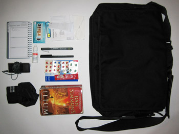
 I will use a recent blog request to catapult this page out of more than a year of utter neglect. Do my bag's mundane contents imply that I have an unexciting soul?
• An underutilized date book. What few entries exist are commonly followed with a question mark to indicate their lack of urgency or my lack of confidence that they will be dealt with.
• Orbit wintermint gum
• A 2GB jump drive from Microcenter
• A crumpled wad of pay stubs
• Walgreens "Original Eye Drops." They claim to be both "original" and comparable to Visine. How contradictory. My eyes get dry at work because the computer of the person who sits across from me has a powerful fan unit that blows warm air up at me from beneath my desk. I assume my computer does the same to him. Unlike Visine, store brand eye drops are not locked up at Walgreens. I don't know why you would lock up eye drops anyway, except that maybe stoners use Visine, and they assume stoners to be shoplifters who shun generic imitations.
• Staedler pigment liner. I prefer the Papermate Flair, Ultrafine
• Sanford uni-ball ONYX. I prefer the Pilot Razor Point II
• A 2GB ipod nano
• Various medicines denoting their owner's easily upsettable stomach and sensitive sinuses
• The crumpled sheath of a folding umbrella. I have bought this same $5 umbrella from Walgreens on 3 occasions since I never have it when it rains.
• An SF novel lent to me by Nik. It's awesome. The gods' home on Mount Olympus is actually Mons Olympus on Mars.
• My bag is a fairly anonymous nylon model from Banana Republic. When I put it under my desk at work I gain pleasure from feeling its magnetic clasps bond to the side of the filing drawers.
Updated: Monday, 22 September 2008 1:25 AM CDT
Post Comment | View Comments (2) | Permalink | Share This Post
 I recently heard Guns n Roses' ode to extreme intoxication, "Nightrain," which employs several metaphors to describe various feelings and degrees of inebriation:

 Da Vinci had some interesting temporary bridge solutions that might have worked, too, but I figure they had this modular steel x-truss scheme worked out with an efficient budget.
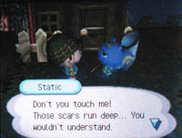
  I was going to name my town in Animal Crossing "Motopia," but then remembered it's the name of this preposterous, car-culture urban fantasy by Geoffrey Jellicoe from 1961. It's also too similar to "Joetopia," a town I like to visit DS to DS. So, I named my town "MouMachi," which translates to Mo-town.


 Out on Long Island there happens to be a wonderful college radio station, there to rescue those seeking alternative airwaves. WUSB is SUNY Stony Brook's station, 90.1 FM, and every other Saturday night/Sunday morning they broadcast an amazing show, "Ridding the Mind of Waste." The show's DJs play primarily electronic and industrial songs, but often mix in humorous, creative audio montages and samples that they seem to put together. The DJ who speaks does so with a parody of a smarmy Oldies station host and refers to himself as "Tommy Edwards, filling in for 58 and Barney," though several years ago I remember him calling himself "58 filling in for Barney."

 Several weeks ago I visited some of the Art Institute of Chicago's popular European Painting galleries. My intention was to take photos of people looking at art (right), which I use to collage into architectural renderings for school. While on the prowl I came across a gory relief sculpture by the Baroque Venetian sculptor Francesco Bertosa entitled The Massacre of the Innocents from 1700. It depicts a scene from the Gospel of Matthew in which King Herod orders the massacre of all of Bethleham's male children to prevent the rise of a new King of the Jews.


 There are no right answers, but to get the most out of Mies, it's important to ask all the questions, and I think that's something Jencks does well.
 However, I completely disagree with his conclusion regarding the Mets recent color theme. He's worried that black will replace the dominance of blue and orange, and cites numerous examples of the team's on-field apparel and a more recent (not universally adapted)
  The St. Louis Cardinals, despite my desperate plea for otherwise, won the World Series tonight. Detroit's fielding was horrendous, and Pudge couldn't hit a thing. The Cardinals continued their pesky, wormy ways, sneaking in revenge-runs after every inning Detroit laboriously managed to score.
 The 2006 Mets postseason ended last night in an exciting game against the Cardinals at Shea. It was a major disappointment for the organization and their fans, but it's important to realize this was the greatest mets team since 1986. If you act entitled to a trip to (and victory in) the World Series people will start mistaking you for a Yankees fan. Newsday ran a headline today, "Heilman couldn't get it done," but the bullpen was close to impeccable this postseason, including last night. If anyone couldn't get it done it was the middle of their lineup--Beltran, (who struck out looking on 3 pitches with 2 outs and the bases loaded in the bottom of the 9th!!!), Delgado, and Wright, all of whom failed to get that big hit the team desperately needed. But let us rejoice in the wonderful season the tenacious and pesky Mets had, stealing bases, playing small ball, and being postseason contenders despite losing 2 of their big starters. They finally have a lineup that can build a dynasty, that they can keep more or less the same for the next several years. One thing that was lacking, to my knowledge, as an estranged Midwestern Mets fan, was a peppy campaign song like this one from 1986. Watch it to the end for the cameos by New York celebrities partially obscured by the poor digitized quality. Please leave a comment if you figure any out. So far I am able to discern Mayor Ed Koch, Twisted Sister, and Cameo.
