 Question or statement [usually a question] that tells of the content of the page1. Section 1Above the question/statement is a theme image that is often of minimal importance, but, sometimes, though rare depending on the document, they are of quite high importance. You'll know if it's referred to while reading the document. This section here is the main page's general content. Many pages are sectionized indicated by the highly distinguishable background given. The section number is indicated as the first character [or two if there's more than 9 sections, which is rare]. Following the section number is it's subtitle. When viewing a cross-reference, you only need to read in the area where the section that was pointed to, as the other stuff isn't of much importance. This is a new feature to version 5.0. In some areas, there are subsections. There may be footnotes* scattered around the page. Almost all of these footnotes are cross-references**. 2. Section 2
Table footnotes: * These footnotes are often different from those of the page footnotes at the end of a page. Sometimes, when a table footnote has a footnote marking***, they are considered page footnotes as they are not in the table and are at the bottom of the page. Most table footnotes are explanatory, but some are cross-references that aren't already mentioned as a page footnote preceding the table. 3. Section 3 Often, you'll see images, usually of diagrams, formulas, and the related. All images are centered in the appropriate area where they are encountered. Image footnotes: * Often, with certain images, there'll be footnotes just below the main image. The footnotes are not marked on the image and never will be. 4. Section 4Main page - Links appear at the bottom of every report with multiple parts. Good examples are the mind game report and the Status System report. The top link is always the main page or home page of the topic in the category. First page of report - Links that are colored in yellow-orange are pages you haven't seen yet [or haven't visited in a while or have cleared your history either via internet options or a system restoration or reformat]. Second page of report - these links, in blue, is the page you are currently viewing. Though it is still clickable, this let's you know exactly where you are especially while reading long reports or reports with many pages. Third page of report - Links that are colored in red are links that you have already visited. Last page of report If you put the mouse arrow over a link, it'll change to something like this. Some browsers, however, may not display this correctly. Updating [usually free] to the latest version should give you this feature. 5. Section 5Footnotes: * All page footnotes appear here. They are always located just above the important links found below the footnotes. ** Almost all of these footnotes are cross-references or a part of a report that requires the use of another report to gain further knowledge on the item you're questioning. Always, if possible, the part that causes a cross-reference to occur is defined without the need of going to the main report that is cross-referred�. Opening these links always open up a new window so you don't have to lose your spot where you were. New to version 5.0, these cross-references now point to the exact section the focus of the cross-reference points to. *** Often, if tables are involved, sometimes a cross-referral may be located here as well, especially if it has occured before the table, but there will be a notice "see footnote ** for details". � Rarely, you'll see footnotes within the page footnotes. These are almost always explanatory footnotes. � Even within the same report, if the same thing occurs and is cross-referred, you'll see the neccessary footnote for it. �� Let's say that you see something that you are confused about. In the cross-reference, it said "To learn more, Read sections 2 and 3 here". This simply means that, if you'd like to read more about it, just read sections 2 and 3 in the page that's linked to. This is a new feature to version 5.0. Now, try to find sections 2 and 3 in the example above. See how much easier that is compared to having to read just the entire report, especially if it stretches more than 5 screens high? 6. Section 6  These two images at the bottom of every page except the main index let you either return home or view the FAQ page. The images represent which go to which. The home animation is of neon lights on a house changing on and off in a special pattern. The FAQ icon is an animation of a big Q [the question] and then the big A [the answer] and the original 3.x "Frequently asked questions" logo comes on then fades away backwards. New to version 4.1, at the bottom of every page, you'll see a collection of animated images. Each taking you to the index page in which you first accessed the document. This avoids the massive use of the back button or having to access the main index and the category index again just to view something else. These images are as follows:    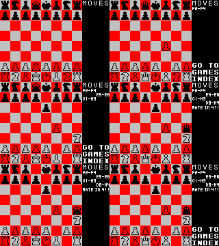  The order of these images to their relative index is as follows: tips and tricks index, features index, about me index, games index, and stories index [the same order as the categories are on the main index]. Even the animation has something to do with the index's main idea. The "about me index" item is an animation of a clock and the text flashing in a pattern you should recognize. The "features index" image is an animation of a book flipping through pages. Very accurate as well. The "games index" image is of a special game of chess called "fools mate" where you can get checkmate in only two turns on each side! Watch carefully for the moves. The "tips and tricks index" icon is of a magic hat and a plunger going into it and text being pulled out on the other side then shrinks to fit in the magician's hat, rotates, then is placed in the hat. The stories index features, well, a story, a weird one. Using the same book from the features index image, the index text fluctuates just exactly at the same rhythm it does on my mind game's map. Only pages that are not in any category like this one or are of extremely minimal importance do not have these extra images, but they do have the basic two: home and FAQ. |
