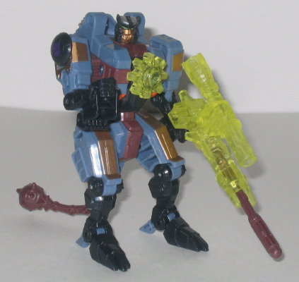
(NOTE: Because this is a repaint, this is not a full-blown review. This mainly covers any changes made to the mold and the color scheme, and merely compares it to Battle Ravage. For a review on the mold itself, read the review of Battle Ravage here.)
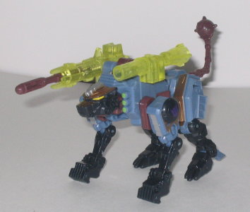
Command Ravage's color
scheme is certainly... original. Greenish black, reddish purple, pale blue...
it just doesn't seem to go together, does it? Well, you're right. It doesn't.
Command Ravage's color scheme seems incredibly random, and the colors don't
really go together well at all on this mold. In fact, I can't think of
them going together well on ANY mold, except possibly a Decepticon whose
alternate mode is a boat of some kind, and even that I'm unsure of. The
pale blue especially doesn't work; it is one of the last colors I'd think
to put on this mold (next to hot pink, of course). The rest of the colors,
however, if taken without the pale blue, could go together reasonably well,
if they had a better unifying color. All of the paint apps on Command Ravage's
chest and legs in robot mode, especially, look pretty nice, if you ignore
the color of the plastic they're on. The various gold and silver paint
apps also go pretty well together. But that darn pale blue just completely
screws up the whole scheme.
No mold changes have
been made to Command Ravage.
Command Ravage has a
pretty haphazard, random color scheme, whereas his predecessor Battle Ravage
did not. So, obviously, I'd have to recommend the original version over
this one. There's just so many schemes that could have fit this mold better...
No Stats
Review by Beastbot