 Optimus
Primal (Universe)


Allegiance: Autobot
Size: Ultra
Difficulty of Transformation: Easy
Color Scheme: Brown with a slight
reddish tint, flat yellow, dark forest green, black, and some brick red,
light red, silver, sky blue, white, and muddy tan
Rating: 7.3
(NOTE: Because this is a repaint, this is
not a full-blown review. This mainly covers any changes made to the mold
and the color scheme, and merely compares it to the original gorilla Optimus
Primal. For a review on the mold itself, read the review of the original
gorilla Optimus Primal here.)
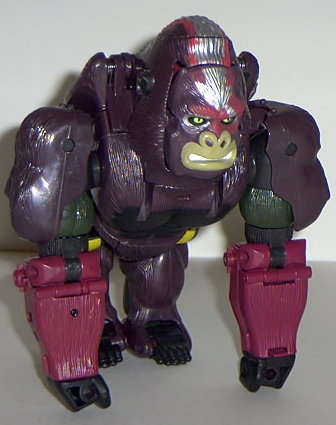
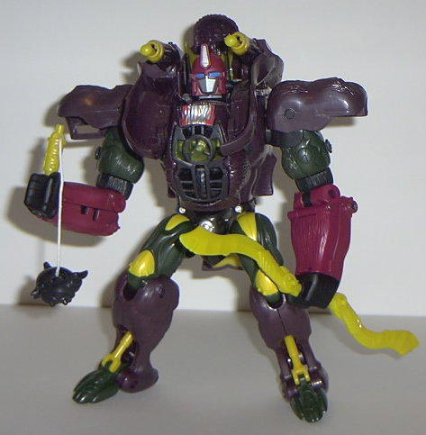
This time around, Optimus
Primal's colors tend to clash a bit. On one hand, I can understand why
the colors are generally this way- after all, this is Primal reformatted
after his Beast Machines self, so I can understand why he'd want to have
"technorganic" colors put on him this time, and brown and green do work
as technorganic colors. However... they just don't work right with this
guy. The green, red, and black do go together well, I suppose, but that's
about as far as I'd go with saying the colors mesh well. The brown really
doesn't mix well with the yellow, and the yellow really doesn't mix with...
well, anything. It's a couple shades too bright and flat, and looks prototypish
to me. Especially on the swords and "Mutant face mask", where it looks
just plain garish. The "energon radiation" pattern on the gorilla head
and upper back DOES look good, but I wish it was a bit larger and a bit
more of a gradual paint app process- instead of fading in, it's just "there"
and looks slightly sloppy. But the silver and red radiation mark still
works, especially where it clashes on the face, giving Primal a "scar"
look to him. Primal also has an Autobot symbol on his left shoulder, under
the shoulder pad. It's pretty easy to miss, though, since you have to look
at it UNDER the shoulder pad.
No mold changes have
been made to Optimus Primal.
Universe Primal's colors
definitely could be better- I liked the original Primal's colors of black,
gray, red, and blue a bit more. That yellow is what especially gets him
this time around- guh.
Optimus Primal Bio:
MOTTO: "We will win if we believe in
ourselves and our unity."
After his ultimate sacrifice to defeat
Megatron, in which he became part of the core of Cybertron itself, Optimus
Primal rose to the level of a mythic legend among the grateful populace
of Cybertron. Now as the battle against the ancient monster planet known
as Unicron has begun once again, Primus himself has called Optimus Primal
to be brought back into action to help in the fight for the very survival
of Cybertron. Optimus Primal represents a uniquely powerful fusion of the
Maximal Forces' advanced technology with the raw power of their mighty
Autobot ancestors. In this supercharged form Optimus Primal possesses unmatched
strength among the techno-organic populace of Cybertron. His weaponry has
also been upgraded significantly: He wields an impressive array of both
long range and melee weapons including twin battle blades that can cut
through solid rock, a vanadium steel reinforced mace, left arm retractable
double barreled plasma cannon, and twin indepently targetable shoulder
mounted missile launchers. Rear mounted jets give him flight capability.
Energy receptors allow him to absorb much of the damage from energy-based
attacks and rechannel it back at his enemies. Intelligence, experience,
passion and skill are all crucial parts of what makes Optimus Primal a
born leader of the Autobot cause. Serves as an inspiration to help others
find their own strength to keep fighting despite the odds.
Strength: 10.0
Intelligence: 10.0
Speed: 8.0
Endurance: 10.0
Rank: 10.0
Courage: 10.0
Fireblast: 9.0
Skill: 10.0
Review by Beastbot
Back to Transformers:
Universe Index

