
(NOTE: Because this is a repaint, this is not a full-blown review. This mainly covers any changes made to the mold and the color scheme, and merely compares it to Beast Machines Dinobot Triceradon. For a review on the mold itself, read the review of Beast Machines Dinobot Triceradon here.)
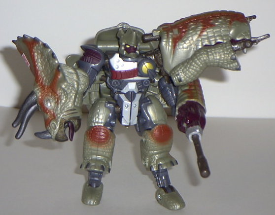
Triceradon now sports
a very eye-catching color scheme of green, gray, silver, and red. The blood
red "energon radiation" patterns in his beast mode look the best out of
all the paint apps, as they're in spray-painted streaks across his back.
It almost looks like he's bleeding from battle damage, or they're bruises
of some sort... very cool, and a nice contrast to the pale light green.
In robot mode, the robot parts look more... well... robot-ish, as they're
mostly gray and silver. I'm not sure if I like the reddish brown choice
for the face, although that's really my only complaint color-wise- the
piercing gold optics look very menacing. In fact, if he looked any MORE
dark, I'd swear he was a Decepticon. (Speaking of which, that Autobot symbol
branded on his forehead in beast mode sure does look dumb. He already has
an Autobot symbol on his spark crystal in robot mode- why does he need
another one?) The dark red and gold highlights also contrast magnificently
with the gray.
No mold changes have
been made to Dinobot Triceradon.
Universe Triceradon
has an absolutely wonderful paint job, and a great energon radiation pattern.
Unfortunately, there's still the problem of all those extras in robot mode...
but really, this is probably as good as the mold is going to get. Makes
a nice display piece.
No Stats
Review by Beastbot