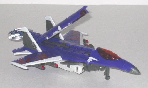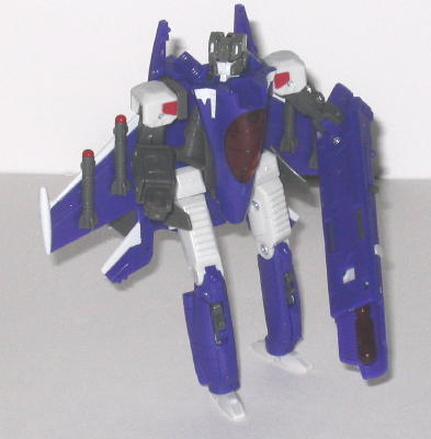

(NOTE: Because this is a repaint, this is not a full-blown review. This mainly covers any changes made to the mold and the color scheme, and merely compares it to Cybertron Thundercracker. For a review on the mold itself, read the review of Cybertron Thundercracker here.)
Like the other toys released
under the same name, Cybertron Skywarp is an homage to the G1
jet of the same name. However, unlike the original Skywarp, Hasbro
decided to go for something a little different with this iteration, and
mix up the color scheme a little. Cybertron Skywarp still has the trademark
purple he's always had-- in fact, it's used much more on this version than
on any previous version-- but G1 Skywarp's trademark black is gone, and
instead replaced with dark gray, red, and off-white. Taken by itself, this
color scheme looks pretty nice, and all the colors fit well together and
certainly don't clash. The red makes a nice accent color, especially, though
the red "broken stripes" on the wings look a little hokey. However, the
off-white and gray simply don't look quite as good next to the purple and
red as black would have. Not to mention it would have differentiated Skywarp
from Thundercracker a bit more-- Skywarp's head and upper arms look nearly
identical to Thundercracker's. I appreciate the effort to "mix it up a
little", but sometimes certain trademark color schemes just need to stay
as they are, y'know?
No mold changes have
been made to Cybertron Skywarp, though the right robot arm stays in its
place SLIGHTLY better than on my Cybertron Thundercracker.
Cybertron Skywarp is
a nice, if certainly less realistic, repaint of Thundercracker, but the
more traditional color scheme of purple-black would have worked better.
Regardless, he still looks better than Thundercracker, in my opinion. Too
bad about the mold...
Review by Beastbot