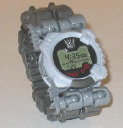
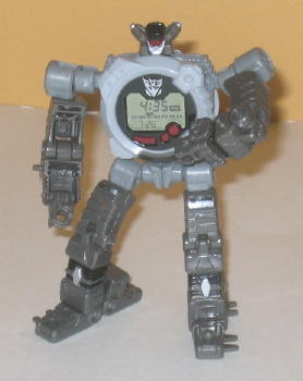
 Midnighter
XR-4


(NOTE: Because this is a repaint, this is not a full-blown review. This mainly covers any changes made to the mold and the color scheme, and merely compares it to Meantime. For a review on the mold itself, read the review of Meantime here.)
Midnighter XR-4 here
is basically Meantime in monochrome. Living up to his name, Midnighter
looks like something at midnight-- i.e., it's so dark you can't see the
color of practically anything. As such, gray is almost his sole color--
the only difference is really how dark the shade is. It honestly provides
for a pretty boring color scheme, as there's very little contrast throughout
the entire figure, and the Movie line already has too much gray as it is,
in my opinion. The black and silver, while nice colors, are still somewhat
similar to gray and aren't used in a large enough amount to really be full-fledged
secondary colors, either. The translucent red used for the optics and part
of the watch face is the only color that really contrasts well against
the gray-- it looks fantastic-- but it's used in precious few places, sadly.
On the plus side, though, Midnighter's watch face is done pretty realistically,
this time including not only the time but the day of the week and month
as well.
No mold changes have
been made to Midnighter XR-4.
Midnighter XR-4 is a
decent enough mold, but his colors are SO incredibly dull. He's practically
all gray, and the only other significantly different color--red--is used
very seldomly. Even though Meantime doesn't have the most exciting of color
schemes either, I'd recommend him over Midnighter.
Review by Beastbot